I’ve been part of the iPhone Upgrade Program for 5 years, which means I get Apple’s new hotness each time it’s released. Last year’s iPhone 16 Pro brought a slightly larger screen, a higher quality ultra wide camera, more optical zoom, and improved battery life in the same body design. This year introduces an updated body design, bumps some of the specs, and delivers something a bit more… vibrant. I ordered mine on Friday and it will arrive in five days. Let’s talk about it.
Color, Finally
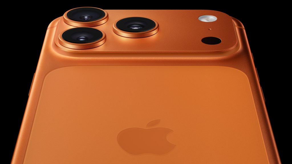
I love colorful hardware. I was all about the translucent iMac and the iBooks in the nineties. I dug the colorful nanos and shuffles of the iPod era and I’ve coveted the colors offered on the regular iPhones throughout the years. Unfortunately Apple relegates the fun to its consumer offerings and I tend to buy the “Pro” stuff. Apple’s Pro products usually get a silver, dark grey, gold, and maybe one muted color. They’re dull, boring, and “professional”. I buy Pro phones for the screens and the cameras and my significant investment is rewarded with lifeless shades. As a result, I own exactly one colorful Apple product1: my Apple Watch Series 8 in (PRODUCT) RED.
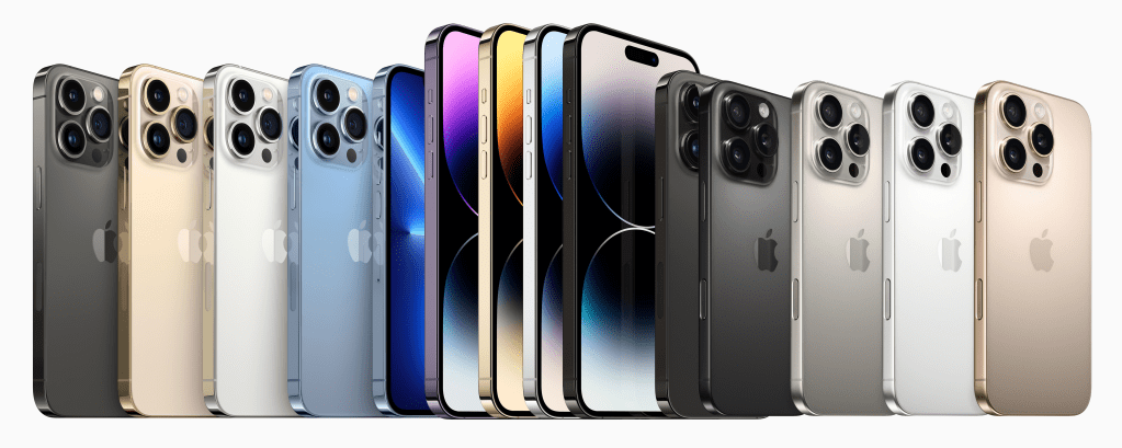
Well no more! This year’s iPhone 17 Pro finally, finally, finally comes in bold colors. There’s your standard Silver for boring people, a blue, and orange. The blue is similar to Apple’s usual Pro “color”, but it has more saturation so it’s less of a grey or pastel. The standout, however, is what Apple calls Cosmic Orange. It’s a bold saturated orange that’s been likened to the color of a pumpkin. Rumors came out over the summer and the general assumption was that it would be more of a copper in typical Apple fashion. That’s what I expected and I planned to get it because it still sounded somewhat different than the norm.
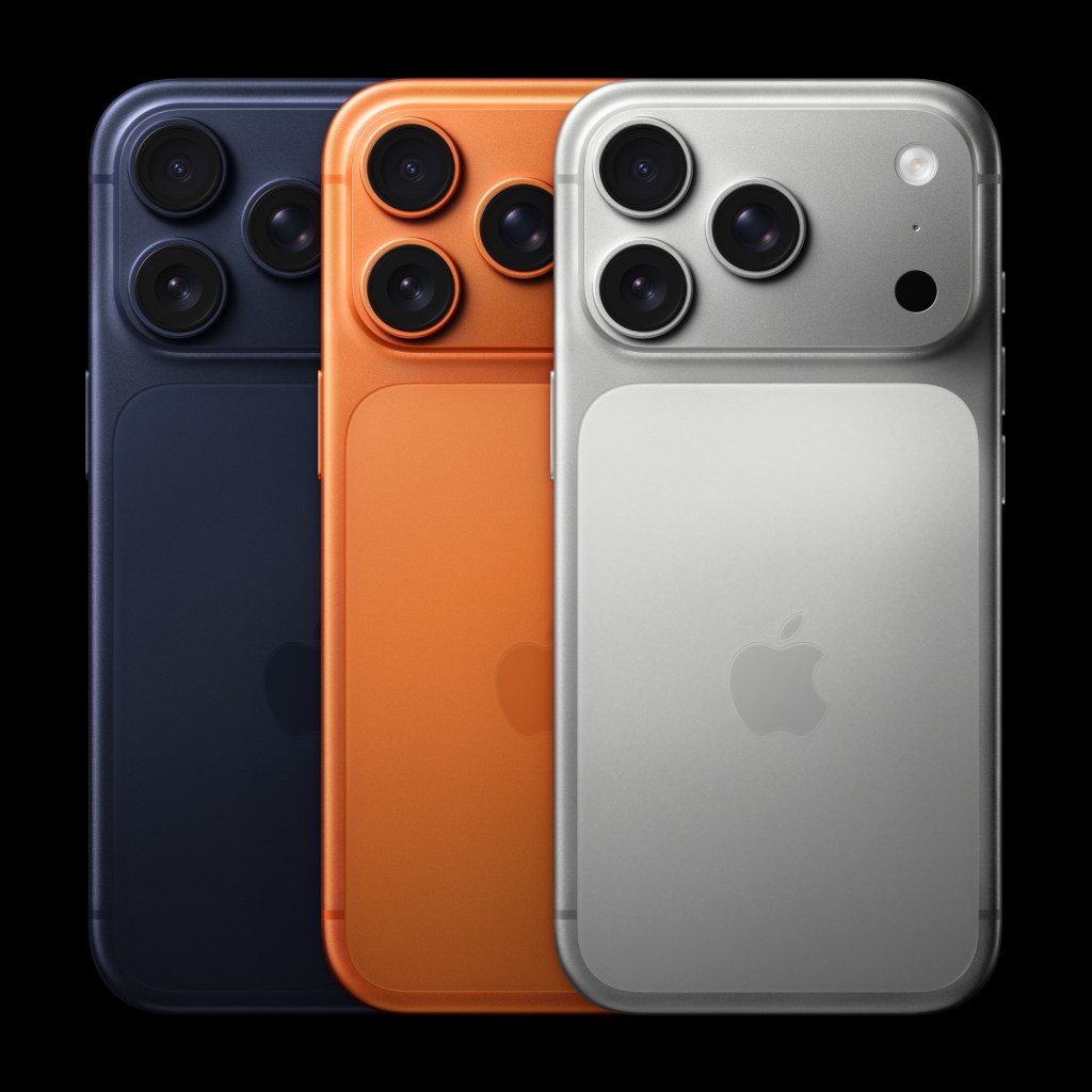
The actual color was a true surprise: bold, saturated, and most definitely orange. Not pastel, not copper, not tan. Orange. I’m so excited to finally get something unique and visible in a Pro phone and I think Apple is too.Cosmic Orange is all over their marketing: it’s the first color you see on their site. They’re proud of it, reactions seem to be positive. For the first time, ever, I think, I like the color of an iPhone Pro more than the colors of the regular iPhone. That’s big.
I think it will sell really well, and if it does, I hope it encourages Apple to continue offering bold colors in its Pro line. I want another bold color iPhone Pro next year and I want to see it expand beyond the iPhone – I want a Cosmic Orange iPad Pro or MacBook Pro! Bring on the reds, the purples, the yellows, and the greens, in deep, rich varieties.
Will Apple do it? If it sells I think they will. At a minimum I can enjoy this one year, this one moment in time where Apple brought the bold back to the Pro.
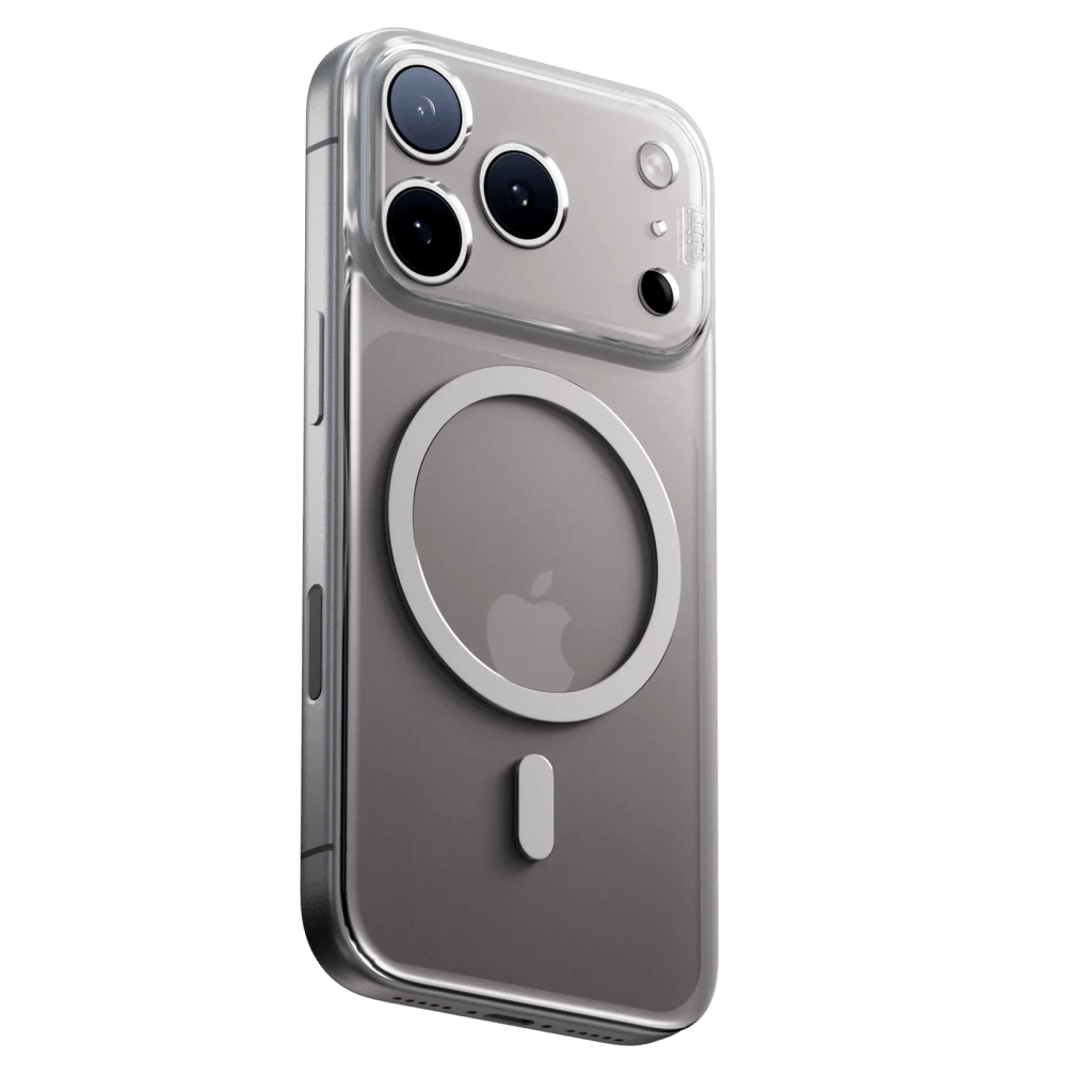
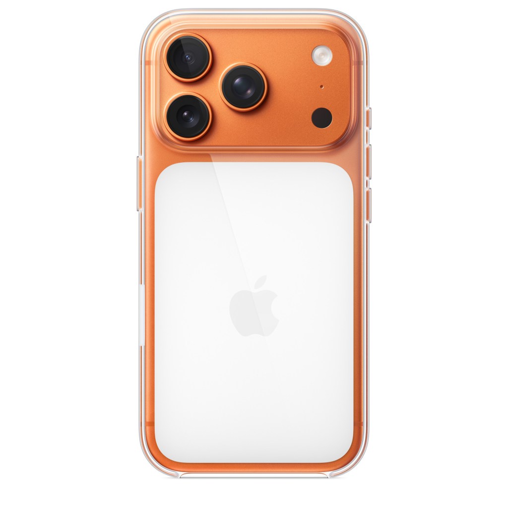
The does create a challenge in terms of the case that I buy. I want to show off the color of the phone, so I’m buying a transparent case. I usually buy PhoneBack cases from Suti which have no sides, but I don’t love their iPhone 17 Pro iteration. The Iconic Plateau shifted the Apple logo awkwardly to the bottom of the circular MagSafe magnet, which looks stupid in a clear case. Apple couldn’t change the location of the magnet without making existing MagSafe accessories incompatible, so this awkward compromise is necessary. I don’t like how the logo looks on the Suti case, but Apple’s case isn’t any better because it covers up most of the color. Some cases have a break in the magnet to show the logo, but I’m concerned that it doesn’t attach as well. I guess I have to deal with an awkwardly placed logo.
What’s New
Buying a phone year-over-year rarely results in huge upgrades. This year isn’t earth-shattering, but it delivers some solid upgrades. Here is the rundown of the differences:
New Body Design
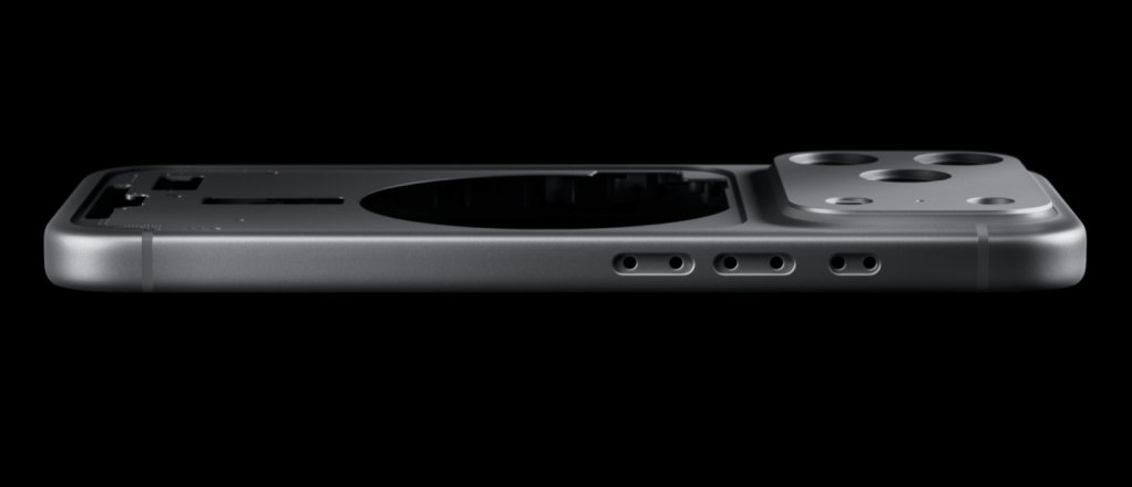
Not earth shattering, mind you, but new. The body is made of a single milled aluminum block (so much for the titanium the made such a big deal about last year) and the camera bump (or “iconic plateau” as they call it) extends from edge to edge. It’s a teeny bit wider, a teeny bit taller, a teeny bit thicker, and a teeny bit heavier, but initial impressions imply that it doesn’t feel any bigger. There’s a stronger ceramic coating all around that’s more scratch resistant. Buttons are all in the same places and the screen is exactly the same. It’s certainly more of a difference than the 15 Pro to the 16 Pro but not as drastic as the iPhone 11 Pro to 12 Pro was five years ago.
New Front Camera
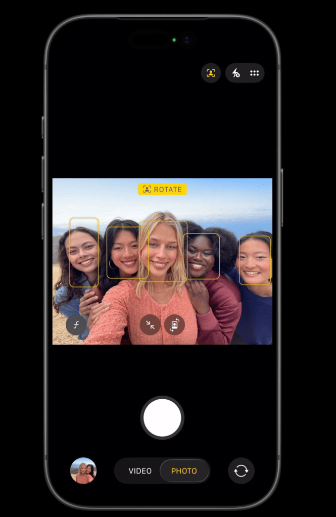
The front camera moves up to an 18 MP square sensor that allows portrait or landscape selfies without moving the phone. You can flip it yourself or let AI do it for you based on the number of people in the frame. It gains stabilized video and will keep you centered in video calls. It also allows dual capture where it will record video from the front camera (i.e. you) and embed it into video from the back camera. This is great for sharing reactions with your friends and even recording web content. I can see myself using both of these features.
New Back Camera
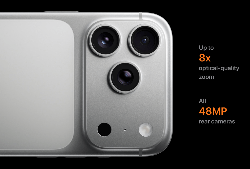
The 17 Pro still has three cameras, but now the telephoto is also 48 MP, with a larger sensor that gathers more light. The other two cameras remain unchanged as far as I can tell. Apple claims it’s “like having eight pro lenses” but some of that is marketing. The user has .5x, 1x, 2x, 4x, and 8x “optical” zoom options but 2x and 8x ratios are actually “sensor crop” zooms provided by cropping the sides off of the 48 MP main and telephoto sensors. This is no different than the 1.5x crop of my crop-sensor Nikons and is what 2x mode was on the iPhone 16 Pro. It’s not digital zoom, but it’s also not technically optical.
The other “three” lenses come from an enhanced digital crop (35mm and 28mm) and macro mode for the ultra wide. These were available on the 16 Pro as well. So while you get 8 high-quality zoom values, there are definitely not 8 physical lenses in this phone.
Better Battery Life
By moving much of the circuitry into the Iconic Plateau, Apple made room for a larger battery. The result is a 20 – 30% increase in battery life depending on what you’re doing. Apple touts 6 extra hours of regular video playback (totaling 33 hours) and 8 extra hours of streamed video playback (totaling 30 hours).
Faster CPU

There’s always a faster CPU in the Pro, and this year adds extra hardware over the A18 Pro. This generation uses the same 2 performance / 4 efficiency core CPU design with a 6 core GPU and 16 core Neural Engine. The new bit is that the GPU cores now include Neural Accelerators to improve their ability to run AI code locally. Pair that with the iPhone 17 Pro’s new cooling system and Apple’s claiming a 40% increase in sustained performance. This is way more power than I need in a phone, but the Neural Accelerated GPU previews what will come down the line to Apple’s beefier M5 or M6 SOC in the future.
“Same” Price
Depending on how you look at it the 17 Pro is either $100 more expensive than the 16 Pro or exactly the same. Apple dropped the 128 GB configuration priced at $999, starting the line with the 256 GB model for $1099. That’s the same price as the 16 Pro’s 256 GB configuration. Apple claims that the price hasn’t changed, but can’t deny that the cost of admission to the Pro has gone up.
What’s Not New?
There’s a fair amount that’s new and a similar amount that’s the same. The screen, Face ID, satellite connectivity, crash detection, USB-C, weather sealing, wireless connectivity, buttons, and gestures are all the same as the iPhone 16 Pro. While the external redesign isn’t earth-shatteringly different than it predecessor, I would count this as one of Apple’s traditional redesign cycles where more of the change is focused on the design rather than the feature set.
What About the Air?
The iPhone Air is cool but it’s not for me. It’s a new design, positioned like the iPhone X was back in 2017. It’s trying to show customers where the iPhone is going in the future. I bought into this idea with the iPhone X, but did it for the capabilities, not the design. The iPhone X introduced Face ID, a larger screen, a better camera, and new genuinely useful interface gestures. While the Air looks sleek and its lightness is nice, it doesn’t offer anything objectively better than the Pro from a usability perspective. It’s actually equal or worse: same chip, slightly larger screen, fewer cameras, lower battery life.
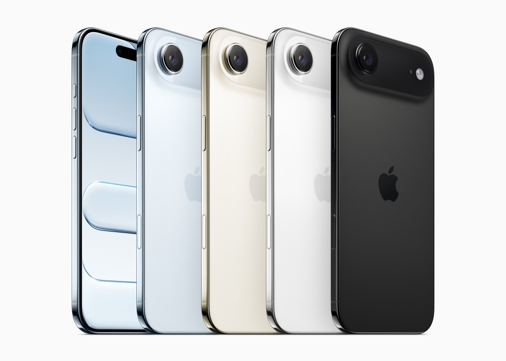
What it’s actually previewing, if the internet is to believed, is what’s next for the iPhone: a foldable. Imagine two iPhone Airs sandwiched together that unfold into an iPad-like layout. That is where the genuinely different experience will come into play. So next year I might own two iPhone Airs 🙂
Excited for Friyay
My new phone should arrive in about five days and I’m really excited for it. Cosmic Orange is a great bold color choice that will stand out. All the other stuff is great too, but Orange is what I’m most looking forward to.
- When I say “own” I mean “actively use”. I actually do own several iPods in fun colors, including red, but I bought them long after they were new and never used them in my daily life. I wear my Apple Watch every day, so that counts. ↩︎

One Reply to “”