As summer winds into fall I’ve been doing a mix of things: a bit of organization and a lot of customization.
Notion
I’ve been using Google Sheets to keep track of my retro museum for at least a decade. I inventory what I buy to understand what I own, what I want to own, and what I’ve paid for the privilege. I capture the details of my systems: noting their specs, software installed, whether they work, and any quirks. I even write how-to articles when I discover how do something that isn’t so natural anymore like network, transfer files, and run certain software.
This has been fine, but I’ve been looking for a different way to organize my stuff. I don’t like the way that filtering in Google Sheets works and I’d like something that integrates text and table-based documents more cohesively. I use Confluence at work quite a bit and considered using a personal instance of it at home. I also wanted something that included a native, or at least local, app that I can run on my Mac. Something that was persistent in my dock and not attached to a browser but synced to the cloud.

Enter Notion. Notion is a competitor to Google’s suite that organizes itself around pages. Pages can include text, images, tables, and even full databases with field types and relationships1. They’re structured in a navigation list and can be nested and reordered. They’re private by default but can be shared publicly. It reminds me very much of a Confluence and it has a local app for both the Mac and iOS. It works on the web as well. The personal version is free and allows unlimited document creation, but limits certain views and collaboration features.
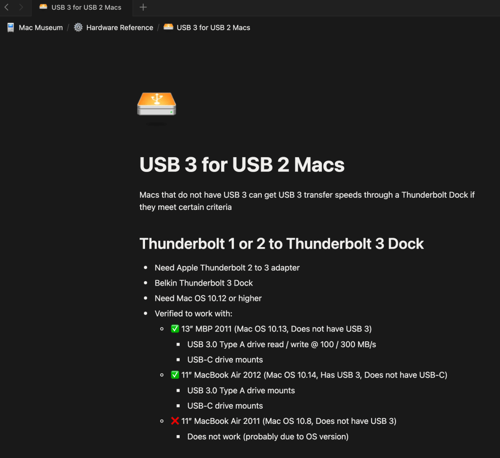
I’ve been using it for the last few months and have consolidated Google Sheets, Google Docs, and README files strewn across my machines. Overall I really like it. Databases work well with typed fields and functioning search and filters, text documents are easy to author like a wiki, and the sidebar is easy to organize and navigate. I’ve set all of my pages to be available offline and do all of my editing in the app.
I’ve really started to dig the ability to assign images to documents and an icon to their pages. It isn’t much of a productivity booster, but it allows for creativity and can help organize things on occasion.
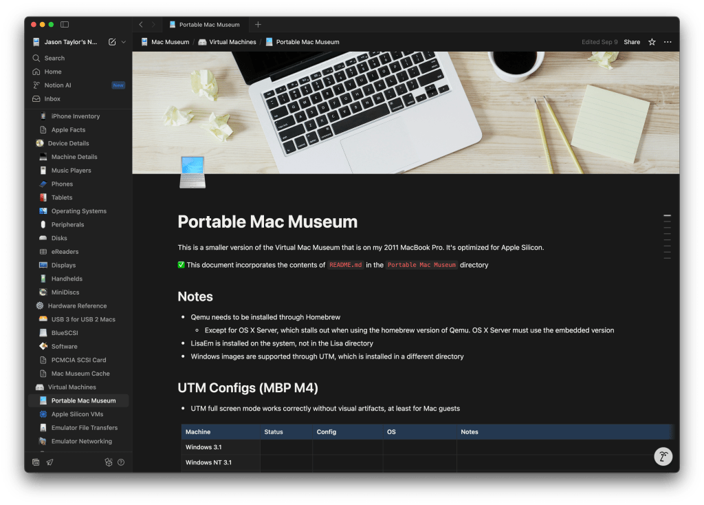
While it’s meeting my needs, Notion does have its limitations, particularly with formatting. For instance, tables allow for basic formatting but background colors are limited to a pre-selected set. Databases are more rigid still. They do not, for instance, allow any formatting of headers – no bolding, no background coloring. I like to customize tables, particularly headers, so this is something I’ve had to get used to. Fonts are limited to serif, sans serif, and mono; there are no individual font sizes, and no page backgrounds. Everything is controlled and uniform, which can be limiting but also freeing, especially when trying to organize a bunch of information. So far these are constraints that I can live within.
One additional bonus: the Notion app works on my 12″ MacBook, providing a lightweight way to access and edit my data. I might even start to use it to draft blog pieces 🙂
CandyBar
UI customization was a huge part of Mac OS culture through the 90’s and early 2000s, with tools like Kaleidoscope (Mac OS 7, 8, 9) and Shapeshifter (Mac OS X) to customize the interface. Custom icons were big starting in System 7, being distributed on CDs included in magazines and across the internet. Companies like The Icon Factory made a business out of crafting and distributing beautiful custom icon sets that could be applied to customize the Mac experience.
Icons have been a core part of the Mac since its introduction and Apple’s support has evolved over time, starting with black and white at 32×32 pixels in 1984. System 7 added 8-bit color and the ability to change the icon of any document, application or folder through the Get Info window in 1991. A 3D style from the canceled Copland project appeared in 1997’s Mac OS 8 and 24-bit color with transparency was added in Mac OS 8.5 a year later. Mac OS X introduced a huge upgrade in resolution to 128×128 pixels in 2001, with later versions supporting 256×256, 512×512, and 1024×1024 by 2011 to support higher density displays.
IMAGE
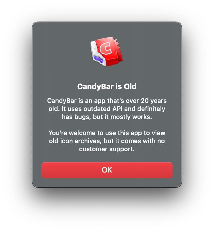
This support and evolution of icons drove significant customization in Classic Mac OS and early Mac OS X. It isn’t as popular now, but it’s still possible to change the icon of any application, file, or folder by opening the Get Info window and pasting in a new image onto it. In the earlier days of Mac OS X, several icon managers hit the market, including CandyBar, which provided a way to collect, organize, and change icons throughout the system. It fell out of compatibility with later versions of macOS, but the Iconfactory revived it in 2022, updating it just enough to work on current versions of Apple’s software2. It has some jagged edges and zero support, but it makes a nice tool to at least gather, organize, and export icons. It’s now called CandyBar Sugar Free Edition.
I took a journey down memory lane, trying to find all of the icons I remember from that time. The Iconfactory provides a bunch of its old icons for free and I scraped others off Macintosh Repository. I now have a collection of over 3000 icons in my library. I really enjoy the Mac OS X era icons because they’re large and detailed. Artists enjoyed making photorealistic icons of Apple hardware because they looked so good at OS X scale; now they perfectly capture the hardware of the time. I’ve had a lot of fun importing them into Notion to decorate my pages and database entries. Now I need to go through and organize 🙃
Basic Apple Guy
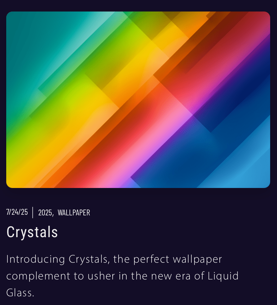
More than icons, desktop backgrounds and wallpapers continue to be popular customizations for traditional computers, phones, and tablets. Each release of the macOS includes new wallpapers, as do iOS and Pad OS. Apple includes great options in each release but there are only so many, so I often supplement. I usually switch between a rotating selection of my own photos, Apple’s, and some that I pick up off the internet. I recently discovered a hugely talented individual who makes wallpapers that bring me back and take me forward. His name is Basic Apple Guy.
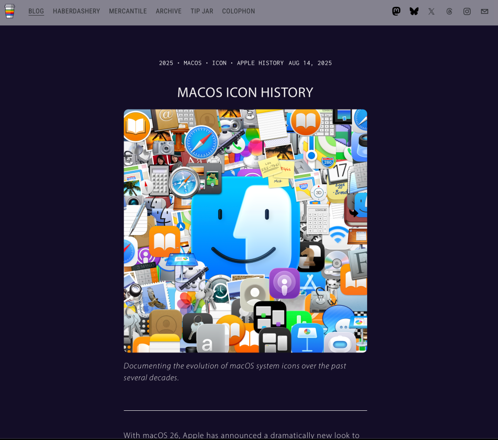
I came across his site when Stephen Hackett linked to his Mac Icon Comparison post charting the evolution of Apple icons throughout Mac OS X going back to 2001. It was a great post, so I read it all the way to the bottom and happened to notice several tags, one being “macos“. Curious, I clicked it, and was rewarded with a huge list of postings full of beautiful wallpapers.

I wasn’t ready for the quantity, quality, or variety of wallpapers I encountered. The first few posts were screen grabs and composites of macOS Tahoe’s Aerial screensavers but the rest were original works and reimaginations. macOS Tiger Redux caught my eye immediately: a high-resolution, modern interpretation of the default blue background of 2005’s Mac OS 10.4 Tiger. I remember that background well and had it on my Macs frequently. This version was brighter and crisper, with similar shapes and overlaps. I fell in love.
I spent the next two days downloading nearly all of his images in Mac, iPad, and iPhone aspect ratios. He uses beautiful gradients, creative shapes, and colorful patterns that look great – they’re abstract and don’t get in the way. Many of the images include an incredible amount of detail, most famously the x-rays of Apple Silicon Macs and Phones, which are manually drawn from thousands of shapes based on teardown photos. The ugly sweater images are also extremely detailed, comprised of individually drawn and placed fibers. These wallpapers take an incredible amount of effort and it shows.
I’ve set these static on my Macs and as a rotating album on my phone that greets me with a fun new image every hour. These are just some of my favorites below.
In addition to wallpapers, he also makes detailed and vibrant holographic stickers for Apple Silicon in the style of Intel’s “Intel Inside” campaign. I bought some “M2 Inside” stickers from a different artist a couple years ago, but these are better. There’s a sticker for each of the M, M Pro, M Max, and M Ultra varieties across all four generations in both light and dark. I ordered the entire Space Black collection 😄
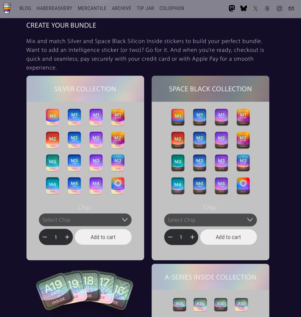
Basic Apple Guy creates his art in his spare time. His day job is in the medical field and he releases all of his art for free. He sells stickers and has a merch store, but also accepts tips or recurring donations. I have the means, so I left a tip in addition to my sticker purchase to cover some of the images I downloaded.
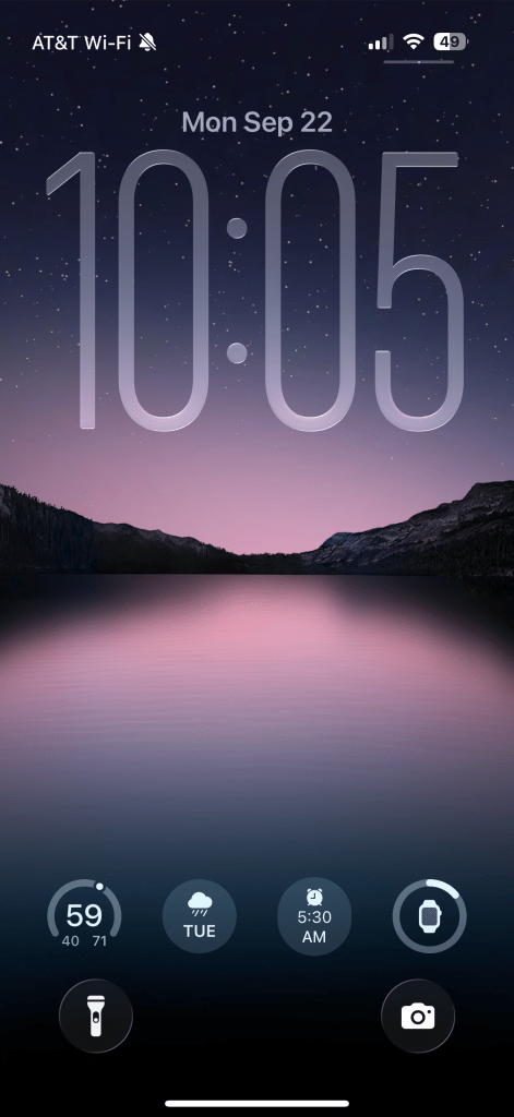
Below is an image of my iOS 26 lock screen with one of Basic Apple Guy’s wallpapers. So tranquil, and that liquid glass looks pretty good.
Bill Atkinson
Bill Atkinson was one of the original programmers for the Macintosh, credited with creating QuickDraw, without which the Macintosh could never have launched. An expert software engineer who came up with incredibly clever way to solve complex problems, he stayed at Apple until 1990, working on the Macintosh, Mac Paint, and HyperCard. He left to found General Magic with other Apple alumni and helped develop some of the founding technology for mobile devices. He passed away in June 2025 and, after reading some great tributes to his life, I learned that he was also a photographer, and an incredibly good one at that.
One of the tributes linked to his gallery, which is full of beautiful landscape and macro images he had taken during both the film and digital eras. There are images of flowers with soft lighting and fine details, broad vistas, deserts, and close up textures that look other-worldly. Many of the images were taken on film yet still look crisp and vibrant. The artistry is incredible and so is the technicality.
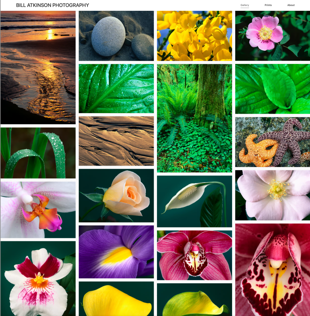
Many of these images are from an age where things were hard – limited exposures on a roll, stiff consequences for not getting the right exposure in camera, time to develop physical prints and scan negatives, and, once digitized, limited and effort intensive editing options. For his film images there were no RAW files that he could dial exposure into, no white balance he could globally adjust, and no AI-assisted masking and noise reduction. All of these edits needed to be done manually and likely required more than just a few Lightroom sliders. That images taken in 1996 look so vibrant is a testament to his technical ability as well as his scanning and editing process.
I was taken by so many of the beautiful images that I spent hours downloading them to use as desktop backgrounds. They aren’t formatted for screen aspect ratios and some don’t have the resolution for today’s displays, but I don’t care: they’re beautiful. I had them rotating as my backgrounds for a couple months – even with black borders around them they look good.
If you’d like to learn more about about Bill Atkinson as an engineer on the Macintosh, you can read stories from that time at folklore.org.



One Reply to “”