
I’ve always been a list person. I like to break things down into tasks and feel a sense of accomplish as I cross each item off. In school I’d make lists in my notebooks to keep track of assignments and at home I’d keep a piece of paper around for personal things. In college I dabbled with digital task lists on my Palm Pilot and OmniOutliner on my Mac, but often returned to paper.

As I started my career I moved to full-on sticky notes, first the standard squares and later the taller lined notes. I’d sit down at my desk in the morning, write out my tasks for the day, and feel that dopamine rush as I crossed them out.My process was specific: tasks were written, one per line, with a fine point Sharpie. Once complete, line items were crossed off with a standard Sharpie, leaving a nice bold strikethrough showing that a task was truly complete.

Eventually managing paper task lists became too much. I needed a place to keep details for certain tasks, which led to paragraph-long todo items or detailed notes in other locations I had to look up later. After completion, some tasks needed to become notes for later reference – I needed a way to track them and find them again. It was at this point I finally decided to put some real effort into going digital.
Digital To Dos
I needed something that was either free, web-based, or built-in so that I could have a single app to manage both my personal and work tasks. OmniOutliner was out because it was commercial software. I looked at Apple’s Reminders app but I didn’t like its feature set at the time. I ended up finding a straightforward app called Wunderlist instead.
It supported tasks across multiple lists with subtasks and notes, it was free, it ran on the Mac and iOS, and it synced between them through the cloud. This was perfect – I could use my home and work Macs to add and manage tasks and my phone to check them off if needed. I could capture notes and turn tasks into reference material without losing them. Eventually, I started using the due date feature to organize what I needed today and push off what I could do tomorrow.
This was back in 2017/2018 and had served me well until recently. As my task management process became more advanced, I started to outgrow Wunderlist’s simple feature set. Despite its purchase by Microsoft in 2015 and replacement with To Do in 2020, its capabilities have remained static. For example, To Do supports notes on a task, but it doesn’t support any formatting1. I couldn’t bold or italicize text, and I couldn’t use bulleted lists, at least on the Mac. I resorted to using asterisks, hyphens, and emojis to format text. Clickable URLs were supported, but titling them was not – the entire ugly url remained visible.
At various points I felt like I was outgrowing To Do. It supported due dates but didn’t have a calendar view. It supported notes but no formatting. It supported tags, but just barely with no way to view them or manage them. It didn’t provide rich view options and didn’t support filters. Search was incredibly slow and limited.
A New Solution
I investigated alternatives several times but never went very far because I was already so invested in To Do. Sure it had its issues, but I knew how to use it and it was integrated into my life. Pretty much everything I did was in it – tasks for work, tasks for home, upcoming appointments, ideas for gifts, things I wanted to collect, events I wanted to plan for – my entire life was in this thing. That meant that migrating to a new solution was going to be time consuming – there’s no clean way to export tasks, so I’d have manually copy the hundreds of planned, inactive, and reference tasks I had amassed into any new solution. The thought of this kept me dragging along.
I wasn’t actively looking for, or even thinking about, retiring To Do, but I happened to come across Todoist on a list of apps that were using Apple’s Liquid Glass design language well. I went to their website, briefly looked over the features and noticed that the price was going to increase on 12/9, which was about a week away. Todoist is a subscription at $5/month or $48/year and it was going up to $7/month and $60/year. I thought this might be a good time to give it a go, especially if I could save a bit of money for the first year. I planned to give it a try for a few days; if I liked it, I’d spend $48. My decision took less than an hour.

Todoist has all the basics – task lists (called projects), due dates, and notes. It has web, iOS, and Mac apps that sync. Tasks support formatted notes – bold, italic, strikethrough, bulleted and numbered lists, first and second level headings, quotes, code blocks, and rich links. Due dates and deadlines can be recurring, and reminders and priorities can be set. Projects can be nested up to three levels deep and labels can be used to group tasks from multiple lists that share common characteristics.
Formatted notes and real labels provided the improvement I needed over Microsoft To Do, but I didn’t expect how Todoist’s additional features and customizations would take my task management to the next level.
Views
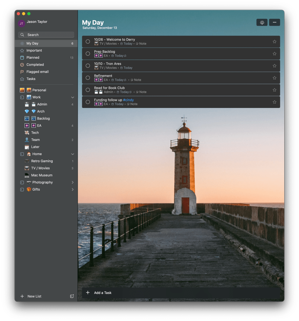
Like To Do, tasks can be viewed as individual lists for each project: in a Today view for tasks due today, and an Upcoming view for tasks with other due dates. Unlike To Do, these views are much more powerful. In list view, tasks can be grouped by project, date, label, priority, or manually dragged around. Within groups they can be sorted by any of these characteristics and filtered by them as well. That’s far better than To Do, which was limited to sorting and automatic grouping by task list.

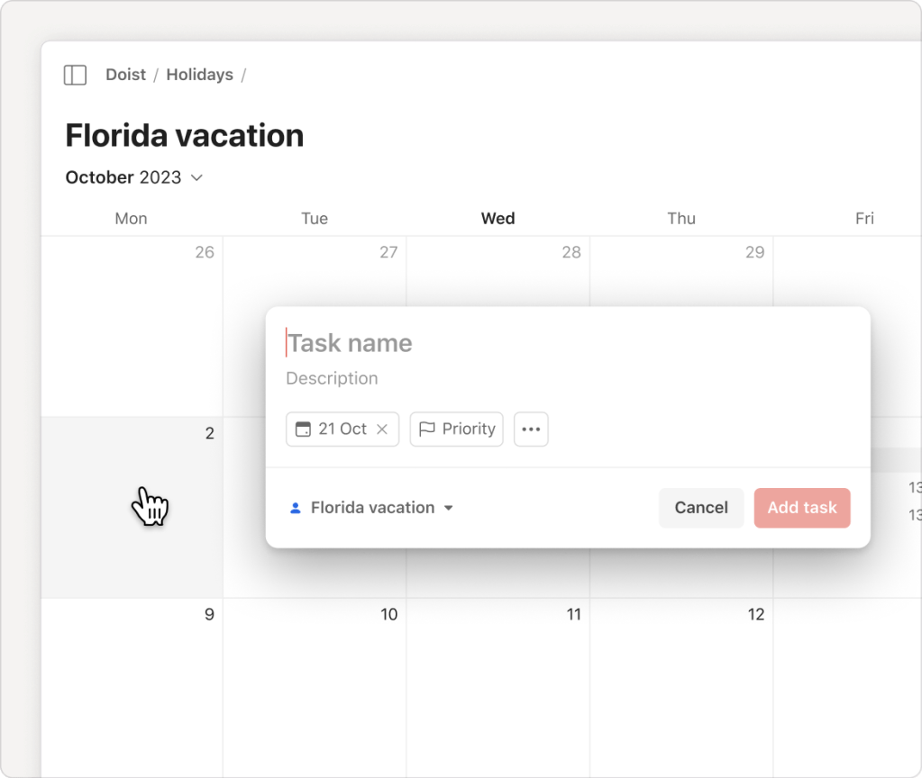
But there’s more. Todoist also supports a calendar view that places tasks across a week or month view. In the weak view they can even be assigned timeframes throughout the day, working as an agenda. I woudn’t use this at work since I already have a calendar, but it might be a neat way to plan my personal tasks for the weekend or a vacation. The calendar view can also be sorted and filtered, and tasks can be dragged around from day to day. It’s an extremely powerful way to plan.
There’s also a board view that arranges tasks into columns like a kanban board. For lists it uses sections as column headers (more on sections in a bit) but for the Upcoming view it uses the days of the week. This is an alternate visual that makes it easy to structure and organize within task lists.
These views are features that I was sorely missing, but much of their power is because they each exist independently. Each project, sub project, query, label, and special view are customizable separately. I can have a list view for my personal tasks, a calendar view for my work tasks, one set of groupings for gift ideas, and another set of groupings for website tasks. It offers complete flexibility.
Filters
Todoist also provides queries (called Filters), which allow tasks to be pulled together into a single view based on criteria. Filters use a simple query language that can combine tasks by project, label, date, priority, and even content. They also support AND, OR, and NOT logic, allowing reasonably complex criteria to be defined2.
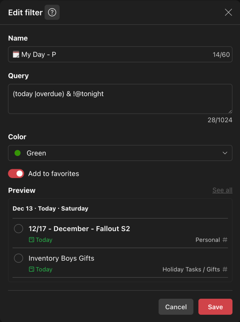
I’ve already used them to replicate the My Day view in Microsoft To Do, which shows tasks due today but excludes those labeled “tonight” that I plan to do after work. I also have filters that show tasks for tonight, tasks due tomorrow, tasks related to the members of my team, and my highest priority tasks for the day.
Labels
I didn’t even know Microsoft To Do supported labels until a few months ago. It’s not a feature listed anywhere in any part of the app’s UI and I only discovered it through a google search. To create a label in To Do, you simply put a hashtag word in the task name like “#Holiday Wrap Gifts”. If you click on “#Holiday” in the task in the task list, it navigates to a view of all tasks with “#Holiday” in them. There’s no way to list all of the labels, there’s no visual treatment for them other than looking like a link, and there’s no way to manage or edit them. They essentially act like a canned search.
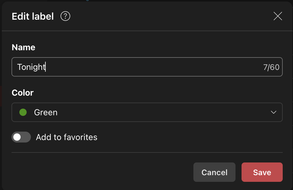

Todoist has full support. Tasks support multiple labels and labels can be renamed, deleted, colorized, and favorited. Views allow grouping, sorting, and filtering on them. Filters allow querying on them. They are a true first class feature. At work, I label tasks from different lists with people’s names if I need to work with them; at home I label tasks as chores or holidays to group them. Todoist makes it easy to label tasks and pull back dynamic lists containing exactly what I need.
Nesting & Sections
Microsoft To Do supports multiple task lists and ways to group them. I broke work tasks into multiple list by topic and grouped them under “Work”. I did the same with my home tasks, my photography tasks, and gift ideas. But these were truly groups. The “Work” group wasn’t a list that I could add tasks to, it was just a folder for other lists. There was no nesting allowed either, which is why I had a separate group for “Photography” instead of putting it under my “Home” group.
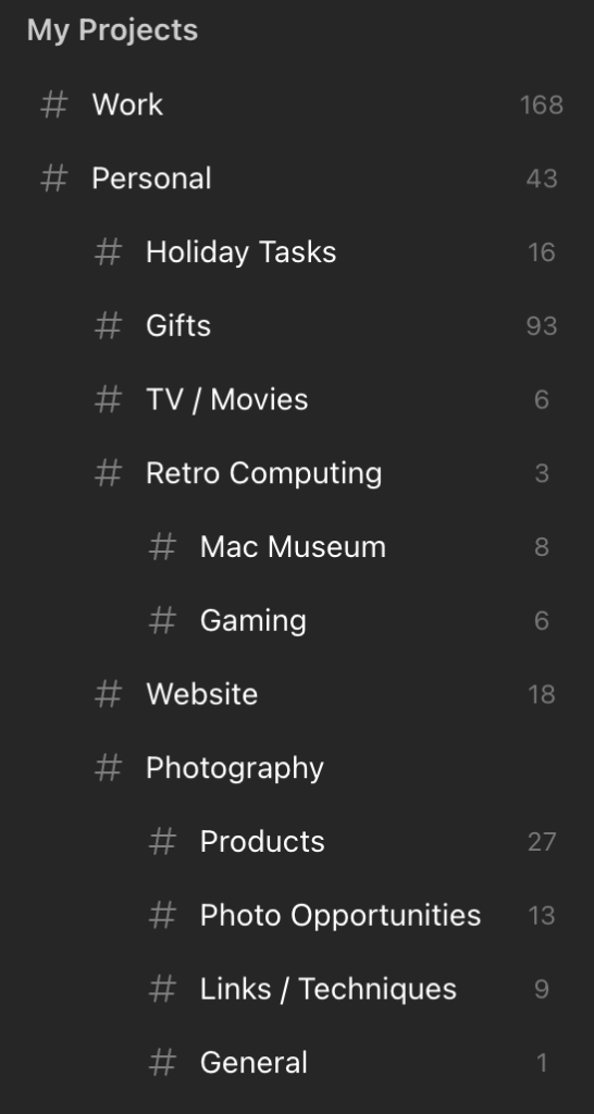
Todoist supports truly nested projects down to three levels. I have a “Work” project with two levels of projects underneath it. My “Personal” project contains my “Photography” project which contains my “Products”, “Photo Opportunities”, and “Links / Techniques” projects. I can add tasks to the general “Photography” project or any of its nested projects with ease.
Within a project, Todoist also supports Sections, which are one more named way to group tasks. I have a “Holiday Tasks” project, for instance, that has a section for “Prep”, “Gifts”, “Christmas Eve”, “Christmas”, and “New Years”. Sections can be dragged around and I’ve placed mine in chronological order so I can easily line tasks up by planning phase. Microsoft To Do has nothing like this.
Quick Add
All of these features of Todoist are easy-to-discover, straightforward-to-learn, customizable, and powerful, but my absolute favorite feature is Quick Add. On the Mac app, Quick Add is a keyboard shortcut, available across the system, that allows tasks to be added at any time. It pops up a small window like Spotlight and allows you to quickly title a task, provide details, set a due date, add labels, and assign it to a project through a point-and-click interface. But its real power is in its smart parsing that allows tasks to be defined completely through description without leaving the keyboard.

Just press the shortcut, type a task name to title, add “#work” to add it to the “work” project, add “@admin” to label it as “admin”, and type “today” to make it due today. Press tab to enter notes or press enter to send it off. It makes adding tasks so fast. Its date support is really extensive too, supporting “today”, “tomorrow”, “next week”, month names, specific dates, and even repetition strings like “every tuesday”, “weekly”, and “the first friday of the month”.
I can’t even do it justice here, but the Todoist documentation, which by the way is stellar, has many great examples.
Quick Add is the most delightful and one of the most productive features I’ve discovered. It’s essentially the only way I enter tasks.
Odds & Ends
Quick Add isn’t available on the iOS app, but Siri integration is. Microsoft To Do doesn’t support Siri, but it supports Shortcuts, which I rigged up to allow voice dictation of simple tasks. Todoist supports much deeper integration, allowing tasks to be added to named projects with due dates. It also supports Shortcuts to do even more. Unfortunately, due to limitations of Siri itself, it isn’t that useful. Most times Siri routes the request to Apple’s Reminders app, leaving me with lots of reminders to “Add fix light switch in Todoist”.
I’m still discovering features in Todoist, one of which is called Templates. Templates allow you to save a project and recreate it later. For example, I run a monthly meeting at work that involves creating an agenda, gathering presenters, creating a slide deck, posting a communication, reminding people for content, and doing cleanup afterward. I can save these tasks as a template and reapply them every month I run this meeting. Now I don’t have to remember every little task each time. I wasn’t looking for this feature, but it was something I wished To Do had at various points.
I mentioned earlier that search is slow and limited in Microsoft To Do. That is another area where Todoist excels. It’s search is a command and search feature like many apps today. It finds commands as well as tasks, sections, projects, labels, and filters, with results that appear almost instantly. It’s incredibly useful. The only thing that might be missing is that the search cannot understand natural language for things like “tasks due tomorrow” or “tasks from @susan”, but given the rest of the feature set, I’m OK without it.
A Note About Apps
Todoist has all the apps – a full web app, iOS app, macOS app, WatchOS app, as well as Android, Windows, and Linux apps. The macOS app is most certainly an Electron app based on its virtually empty menu bar, but it works perfectly fine for me. It’s fast and responsive and hooks into native capabilities where I need it to. The iOS app is native and has all of the natural integrations and fluid interactions I’d expect.
What About To Do?
While Todoist provides a lot of features I’ve been looking for, I don’t think that Microsoft To Do is a bad task manager. I simply outgrew it. If you’re looking for a simple task manager that supports basic notes, multiple lists, and due dates, To Do is a good choice. It’s free, runs on multiple platforms, and syncs to the cloud. I haven’t done a deep dive into Reminders lately, but that might work too if you don’t need to share outside of Apple’s ecosystem.
Moving Forward
I am incredibly happy with Todoist. It was completely worth the $48 I paid for it this year and it will be worth the $60 I have to pay for it next year. After spending about a week running Todoist and Microsoft To Do concurrently, I’ve recreated all of the tasks and reference notes I care about. I started with any dated tasks I had for work, then recreated dated tasks for home, followed by reference tasks for work and then home. The transition wasn’t as terrible as I thought it would be and I now have over 400 tasks in my Todoist projects. Going into 2026 I feel more organized than ever!
- At least on the Mac app. It supports bulleted and numbered lists, bold, italic, underline, headings and links in iOS. The Mac app can see the formatting but can’t see the formatting and destroys it all if the note is edited. ↩︎
- If I was to offer one criticism, it’s that queries are impossible to understand in the app without clicking the help button to view the documentation. There is an AI prompt that will try to generate one, but I didn’t have good luck. I was expecting some form fields and drop downs to at least construct a rudimentary query. That said, they are not difficult to create once you read the docs. ↩︎
