
I enjoy the evolution of products. I love technical evolution – changes in speed, density, capabilities – and I love design evolution as well. I’ve chronicled it for my Macs, and my cameras are no different. I own two representations of Nikon’s first and second generation professional DSLRs: the D1H and the D2Xs. I will refer to them by their generation (D1, D2) from here on out. Both are full-size bodies with a built-in vertical grip and both represent significant refinements in Nikon’s designs, refinements that endure to this day.
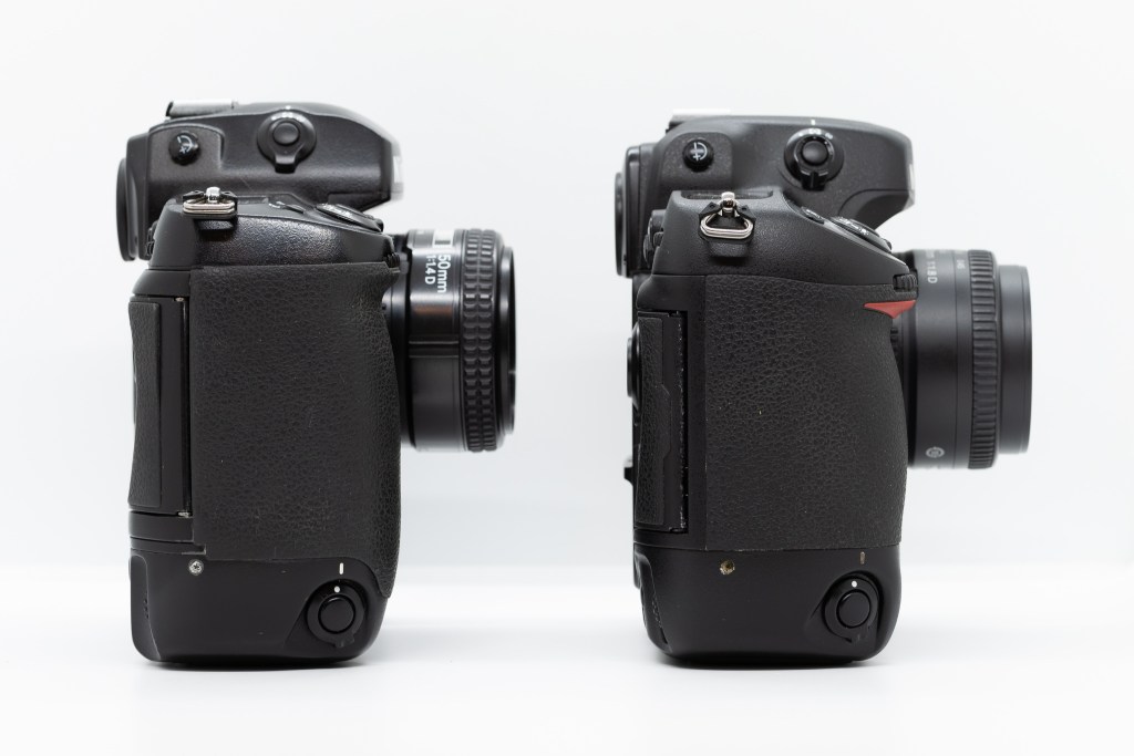
From a general perspective, the two cameras are very similar. They are roughly the same size, have similar proportions, and have similar control layouts on the top and front. They both have review screens, CF card slots, four-way controllers, and secondary LCDs on the back. But the D2 is a huge iteration over the D1 in many ways, refining its conventions and introducing some new ones that continue to this day.
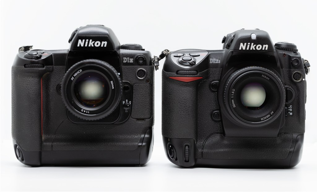
Before diving into the D2, we should recognize the design foundations introduced by the D1. It was Nikon’s first DSLR designed from the ground-up (instead of being a hacked-up film body) and was the first mass-market DSLR with reasonable performance at a (comparatively) affordable price. While the digital components are integrated, it still takes its lineage from Nikon’s film cameras, the F5 and F100. Its overall shape, build, viewfinder, and lower back section (complete with magnetic control cover) come from the F5. The top and upper back come from the F100 – with buttons sharing the same shape and positions in many cases. The digital bits (at least on the outside) come in the form of a review screen and a CF card slot under a door in the hand grip.

Much of that design persists in Nikon’s professional level cameras to this day – even the mirrorless Z9 has a mode dial on the top left, a small screen on the top right, an on/off switch around the shutter button, two command dials, two buttons to the left of the viewfinder, and two buttons to the right of it. These controls existed on the D1 in 1999. They endure in the same way that the Mac menubar has since 1984 – refined but never replaced.
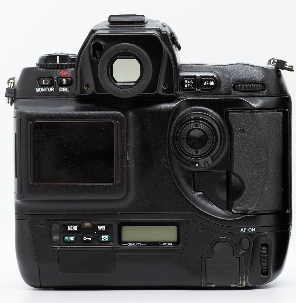
While it established many conventions that are still in use today, the D1 is still a transitional design. It’s boxy and awkward in places, some of the controls don’t make sense for the digital era, and it’s unrefined. The rear screen, for instance, sticks out from the back of the camera so much that it almost looks like it was slapped on after the fact. I’m sure this is necessary to fit the electronics in, but it looks jarring. The Monitor and Delete buttons to the left of the viewfinder are the exact same buttons from the F100: small, flat, and difficult to press. These buttons had different functions on their film predecessor, but assigning one to image review was a terrible choice given how often it’s used.
The menu and function buttons suffer the same problem but are also hidden behind an awkward magnetic door. I can’t imaging anyone interacting with these with gloves on. The vertical grip has a duplicate rear command dial and an AF-ON button, but it’s a soft rubber button unlike the rest of the camera. Curiously there’s no duplicate front command dial. This seems like an odd omission, but the F5 doesn’t have any duplicate command dials to inherit.
Overall the D1 is usable, but its digital parts feel grafted on. While much better than previous digital cameras, the ergonomics suffer from this mishmash. It’s pretty heavy and my hands don’t fit quite naturally on it, making it difficult to reach some of the buttons that are already too small. It’s obvious that Nikon was still figuring digital out as its button choices do not represent the experience of frequently reviewing images and navigating menus that we’ve become accustom to in the digital era.
While the refinements to the D2 body style are very much iterative, they add up to a huge evolution of Nikon’s DSLR design. The most obvious changes are on the back of the camera, starting with the relocation of the larger review screen to the middle. In the D2 series it’s flush with the back and looks like it belongs there. The vertical grip is better integrated, with its dedicated LCD situated below the review screen and its larger buttons below the LCD instead of hidden behind a door. To the left of the review screen are glove-friendly buttons which persisted all the way until the introduction of the mirrorless Z series. The menu button is one of these buttons, rescued from underneath the magnetic door at the bottom of the vertical grip. An additional selector for AF mode is included, the second AF-ON button is plastic like the rest of them, and the vertical grip has both rear and front command dials. Those dials are now rubberized for better grip and feel.
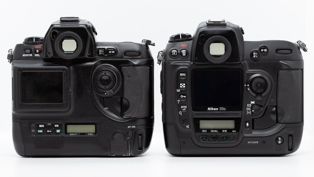
All in all the back of the camera is laid out in a much more functional way and is refined with smooth surfaces, gentle curves, and sculpted grips to make it more usable, comfortable, and better looking than the D1. This general design endured through Nikon’s entire DSLR era up to its flagship D6 and even its hybrid mirrorless D780. Even though the mirrorless Z9 dispenses with the LCD under the review screen, it still has three buttons in that area.
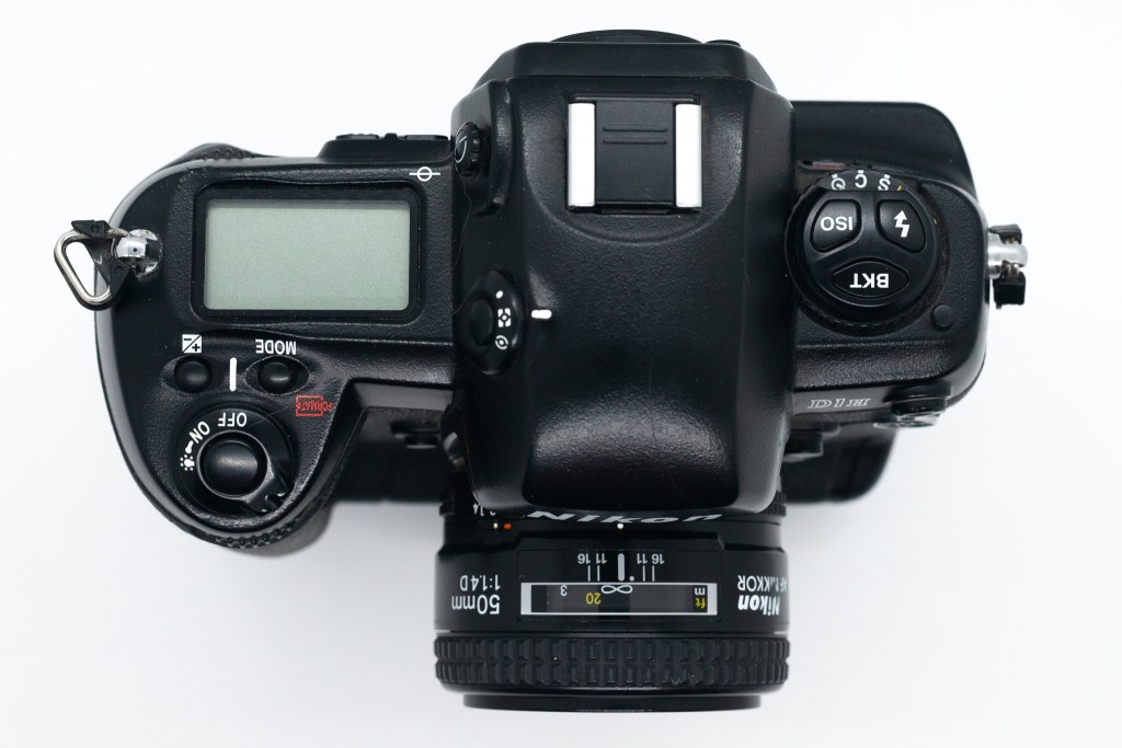
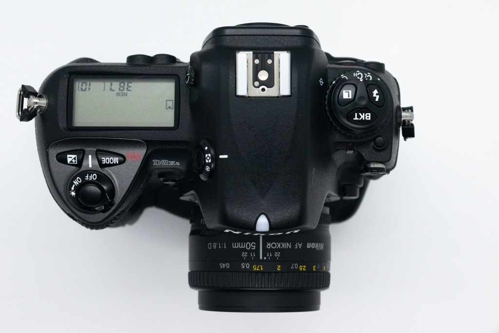
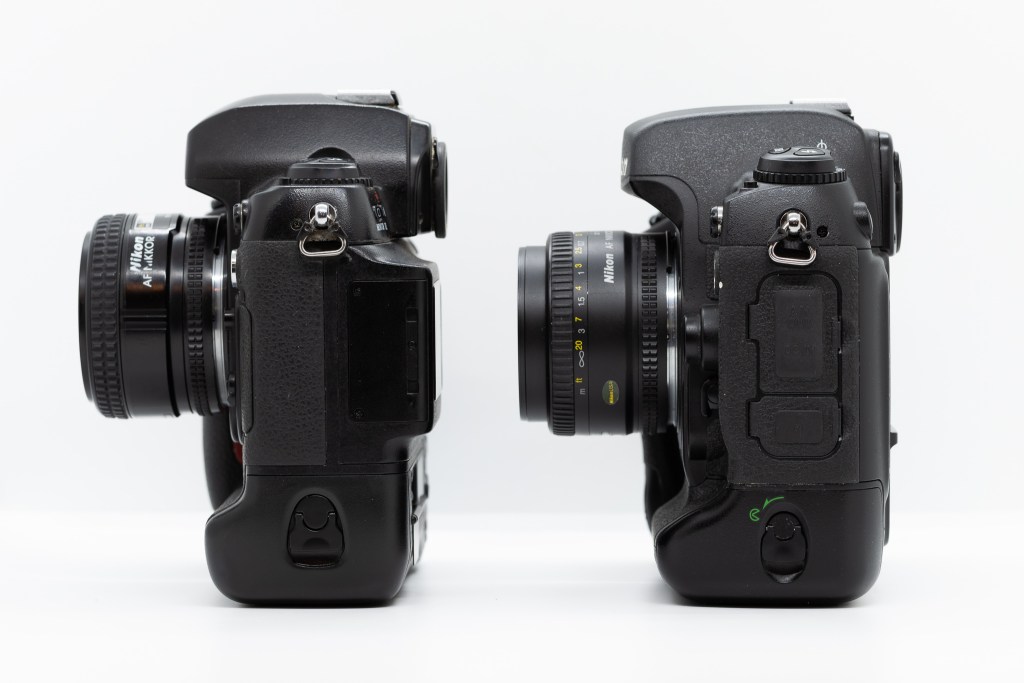
While the back sees the most major refinements, there are adjustments elsewhere as well. On top there is a wider LCD that displays more information (even when it’s off), a slanted shutter button area, convenient relocation of the A/V, power, and data ports to the left side, a much larger lens release button on the front, and an extra function button on the front as well. Both the horizontal and vertical grips are resculpted for better handling. The overall design of the D2 is smoother, the pieces fit together more cleanly, and I find the handling to be much improved.
While generally similar to the D1, the small changes in the D2 series add up to a significantly improved shooting experience. It’s evident through the larger and better laid-out buttons, additional redundant controls, and reorganized back panel, and reshaped grips that Nikon was listening to its customers and learning how they needed to operate in the digital age. The design is so enduring that you might mistake a D2 for a D6 or vice versa if you weren’t looking long enough. That’s a pretty good legacy.

nice review great comparison now onto the next two phases D2-D3-D4 what happened and why?
LikeLike
I have a mint D2X and love it every moment.
LikeLike