
![]() When I started work on Players, I decided to focus on functionality over graphics and prettiness. Now that the app has reached a stable place feature-wise (for now), I’ve had a chance to finally start working on graphics. I actually did create an icon for version 0.2, but it was horribly crappy and I never actually showed it to anyone. I’ve toyed around with some ideas for an icon, but since graphic design is not my strong suit, I had to go with something that I could actually accomplish.
When I started work on Players, I decided to focus on functionality over graphics and prettiness. Now that the app has reached a stable place feature-wise (for now), I’ve had a chance to finally start working on graphics. I actually did create an icon for version 0.2, but it was horribly crappy and I never actually showed it to anyone. I’ve toyed around with some ideas for an icon, but since graphic design is not my strong suit, I had to go with something that I could actually accomplish.
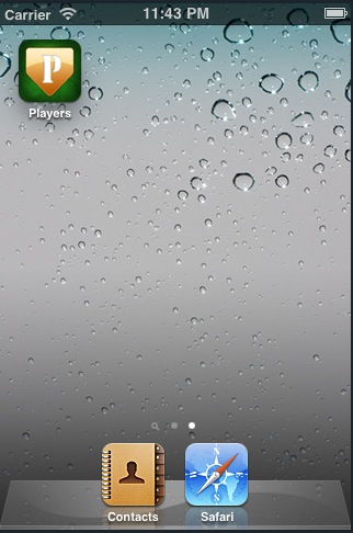
The icon to the left is what I came up with. It’s a home plate (the only softball-related graphic that I can draw at the moment) on top of a green texture (loosely representing grass). The P is for Players to make the icon easy to recognize. I added some noise to the home plate for texture and a shine to make it look “cool”. Now this probably won’t be the permanent icon for Players, but at least it’s something that I can build on.
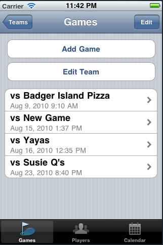
In addition to an application icon, Players never had icons for its toolbar. It was just a naked black button with text at the bottom. That was quickly remedied thanks to Joseph Wain and his free Gliphish icon set. I was able to easily find icons that represented my toolbar buttons and they look far better than anything that I could come up with. They’re even free! Thanks Joseph! The new app and toolbar icons can be seen in action below.

Hey Jason,
The icon looks great! What program did you use to make it? Just photoshop?
-Tyler
LikeLike
Yes, I just used Photoshop and combined a couple of tutorials together. Glad you like it!
LikeLike