
I’ve enjoyed fonts since I was young. When I was in high school taking notes, I’d sometimes create fonts instead of doodling. I’d write all of the letters as neatly as I could, styling them in different ways. While I tried to be neat, I also liked the idea of handwritten fonts. I’m not ashamed to admit that I was a fan of Comic Sans back in the day and I’m a fan of Apple’s Chalkboard and Marker Felt as well. I was bummed when iOS 7 took all the fun out of the Notes app and banished Marker Felt to the dumpster.
I really like handwriting fonts for things that are temporary or draft – quick notes, labels on sketches, short passages – and I’ve always, always, always wanted to create a font out of my own handwriting. In the past that would require drawing the fonts pixel-by-pixel or vector-by-vector with a mouse, which was not something I wanted to invest in. Luckily technology has advanced and making a font is as “easy” as filling out a template and taking a picture of it using a tool l called FontCrafter.
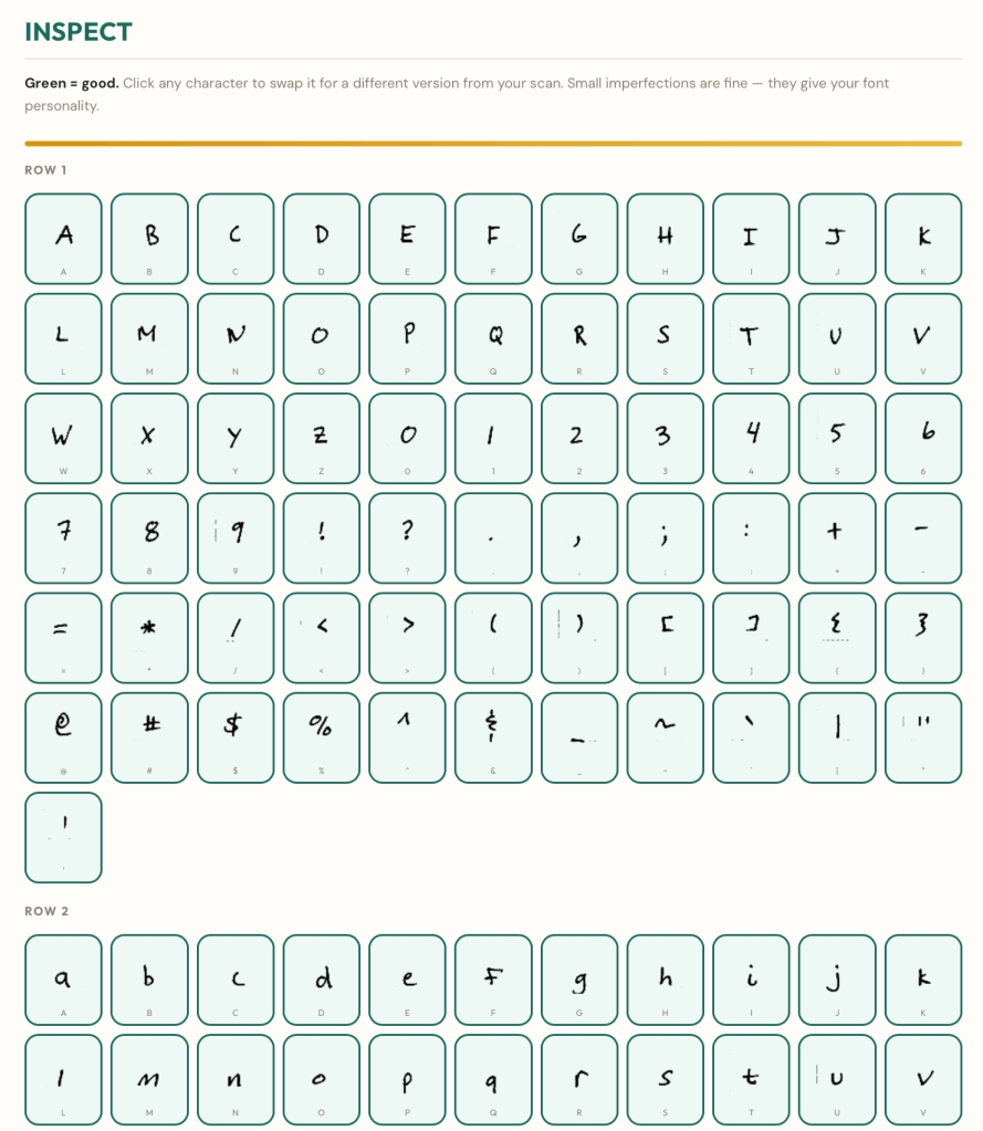
The process starts by printing and filling out a template. Each character is written (yes, by hand) three times – once uppercase, once lowercase, and one more time either way. You take a picture of the completed template and upload it into FontCrafter, tune the characters, and generate the font. Once the font is generated a preview of different phrases is provided as well as a free text field to type your own text into for testing. If you don’t like the output, you can go back, adjust, and regenerate again.
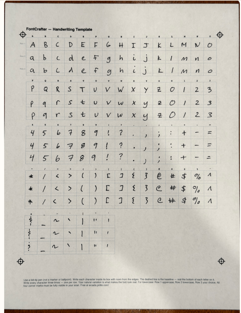
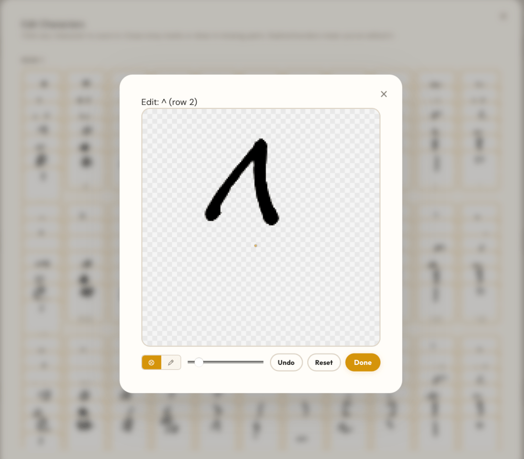
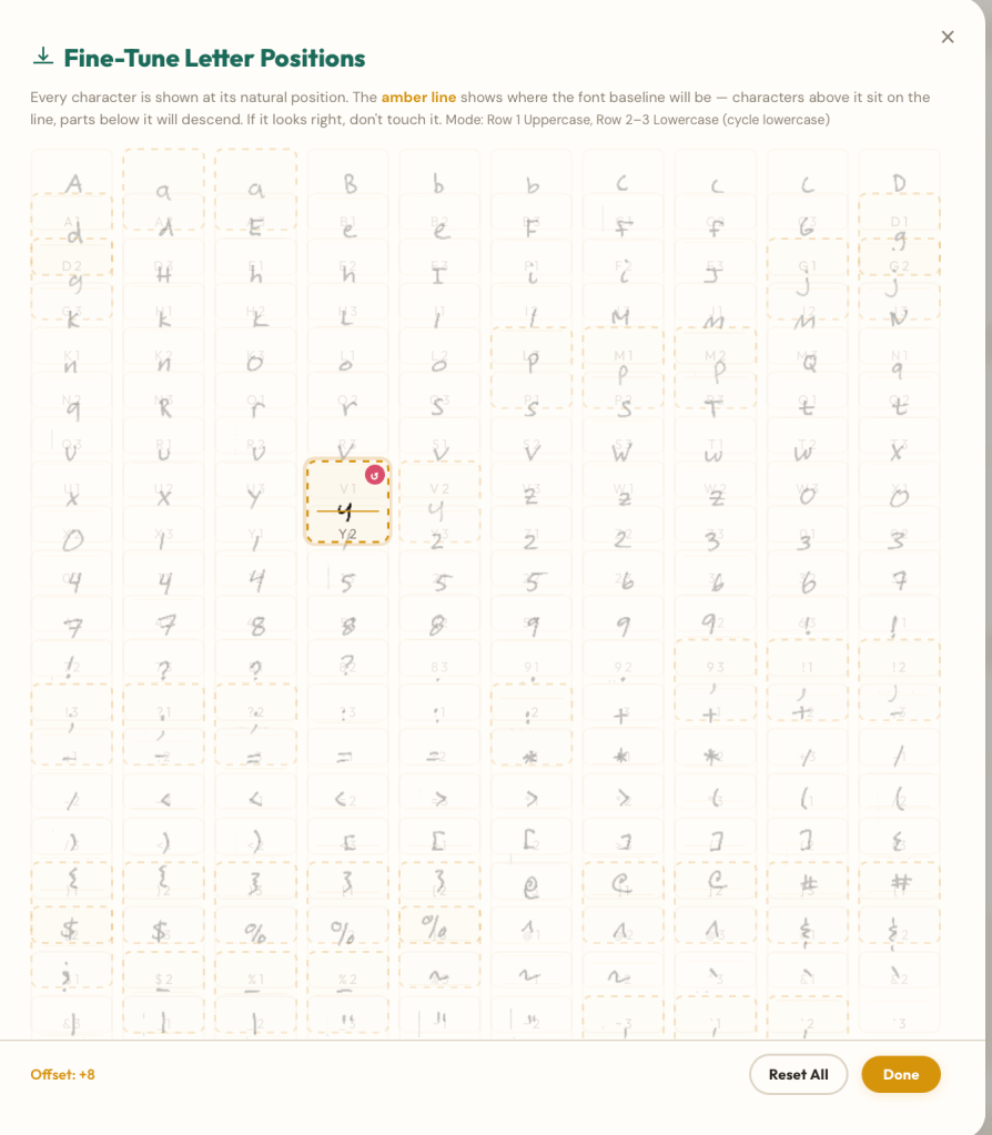
All in all I spent about two hours tuning my font. That’s longer than I intended, but I’m happy with the output. I had to print two templates because I didn’t align the letters correctly the first time, and had to take multiple photos to capture the sheet clearly so that dust, dirt, and shadows were not recognized as characters. Pro tips: take the image in a bright room so that the contrast is high (bright whites, dark blacks, no gradients) and don’t put the paper on top of anything that can show through. Once the image was imported I had to edit each character to remove superfluous marks, fix baselines, and redraw characters (notably g and y) that had their tails cut off.
FontCrafter makes it easy to do all of this in a loop – generate the font, inspect the output, go back and reconfigure the settings, and repeat until you’re satisfied. The final font can be exported as True Type, Open Type, Web Font, BASE64, or a zip file of all four. You can even save the settings as JSON to tune the font later. That’s exactly what I did after writing the first draft of this passage: I adjusted overall spacing and pulled my apostrophes down to look more natural, resulting in a version 2.0 of my font.
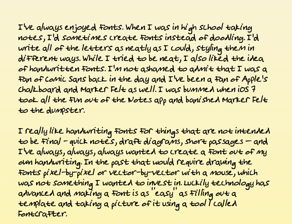
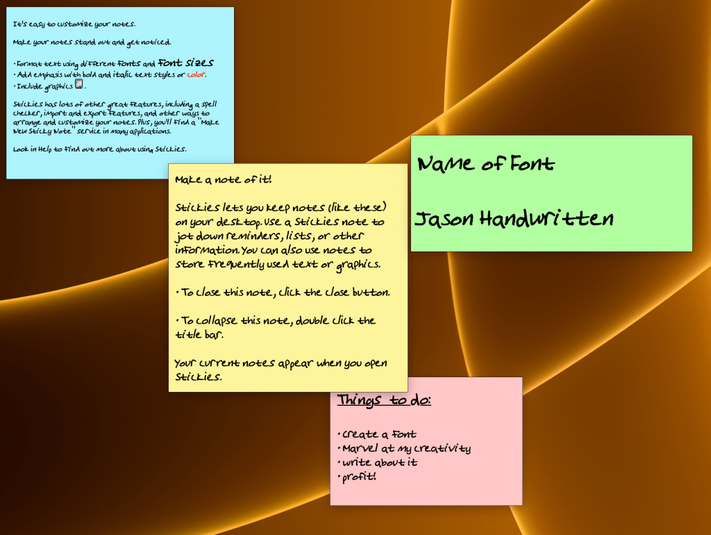
It’s been fun to write a post using my own handwriting. While I’d love for you to see this font in the post, my WordPress subscription level doesn’t allow it. The best I can do is provide an image of what it looks like in practice as well as a downloadable PDF of this article cast in my handwriting, promising that I wrote most of this in Pages in my own ‘handwriting’. One thing I’ve noticed about my font is that it doesn’t support bold or italic styling but can be underlined or struck through. I’m not too sad about it, as it’s from a free tool. The ligature version of the font also varies the characters as you type, so repeating letters in a word like ‘peer’ cycles between two styles of ‘e’, making it look a bit more natural.
I won’t use this font too much, but I’ll continue to refine it. Maybe I’ll create some more variations like a super neat one and maybe cursive.
